Sway is designed for a new era of publishing and communication. An age that focuses on the web and mobile. It’s is also available as a modern application on Windows 10 and mobile platforms such as iOS and Android.
Publish Content Using Microsoft Sway
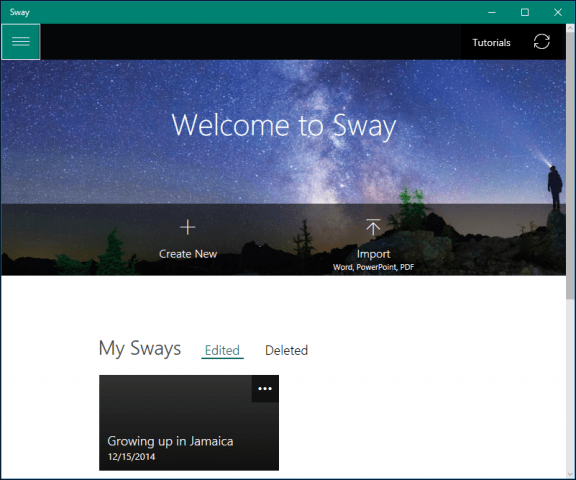
If you are running an older version of Windows or an alternative platform such as macOS, you can access the service through a supported web browser to create your Sways. For this article, I will be focusing on the universal application bundled with Windows 10. After launching Sway, you are greeted by the simple gallery interface. Here you can create a new Sway or import content from an existing Word document, PowerPoint presentation, or PDF file.
You can open, play, share or delete existing Sways from the gallery. The hamburger menu lets you manage your account and application settings.
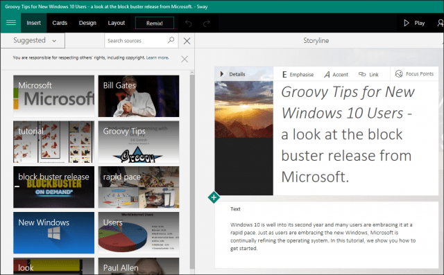
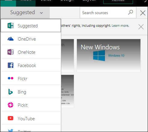
When you are ready to create a Sway, click Create New. As you can see below, Microsoft Sway is unlike any other Office application; but there is some familiarity if you have used applications like PowerPoint before. Sway requires an active internet connection to edit and sync changes. At the top are menus where you can access text-based tools, insert various media types from different sources such as Twitter or YouTube and modify the design and layout of your content.
The Insert menu provides suggested media when it detects the content you are preparing based on keywords in your Sway.
If you find something of interest or relevance, select it, then click Add. If you want to add a background, you can choose from various sources, including YouTube, Facebook, Flickr, OneDrive, or locally.
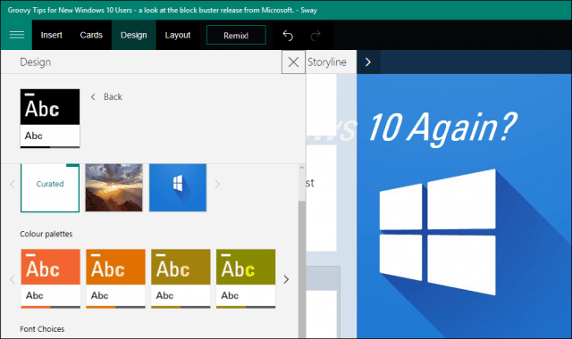
The Design menu provides a gallery of suggested canned color schemes. Existing ones can be modified to fit the theme of your Sway. Options for font styles and animation behavior are also available.
The Layout tab features different ways you can present your content.
The storyline is where you create your content; this starts as a card, including a background image, title, and formatting options. You can have a particular card for headings and another for text. If you want to modify a card, such as delete or change its position, select the card, then click Delete. To change its position, select it, then drag, just like you would a slide in a presentation.
When you add content, you can see a real-time preview of what your Sway will look like when published. Use the maximize Storyline button to see a full preview.
Publishing Your Sway
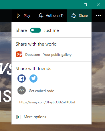
When you are ready to show the world your Sway, you can click the Share menu and choose various sources. These include social media, Microsoft’s public document network, or generating an embedded code you can then share with specific recipients.
Sway, just like other Office applications, features built-in tools for collaboration. The app complements other apps such as OneNote, making it easy for students to create and share content less demanding.
I used Sway more; I realized how much it is a closer cousin to PowerPoint than even OneNote itself. The application can come across as jarring at first, but once you get the hang of how it works, you will begin to love and see the benefits. This tutorial does not go into all details, particularly for functions like the Remix menu, but in future posts, we hope to look at those too. For students who want a new way to have fun with team projects and teachers who would like to engage students, Sway is an excellent way to do it. Tell us what you think. Have you been using Sway? Comment Name * Email *
Δ Save my name and email and send me emails as new comments are made to this post.
![]()

